Neurosoft S.A.
Description
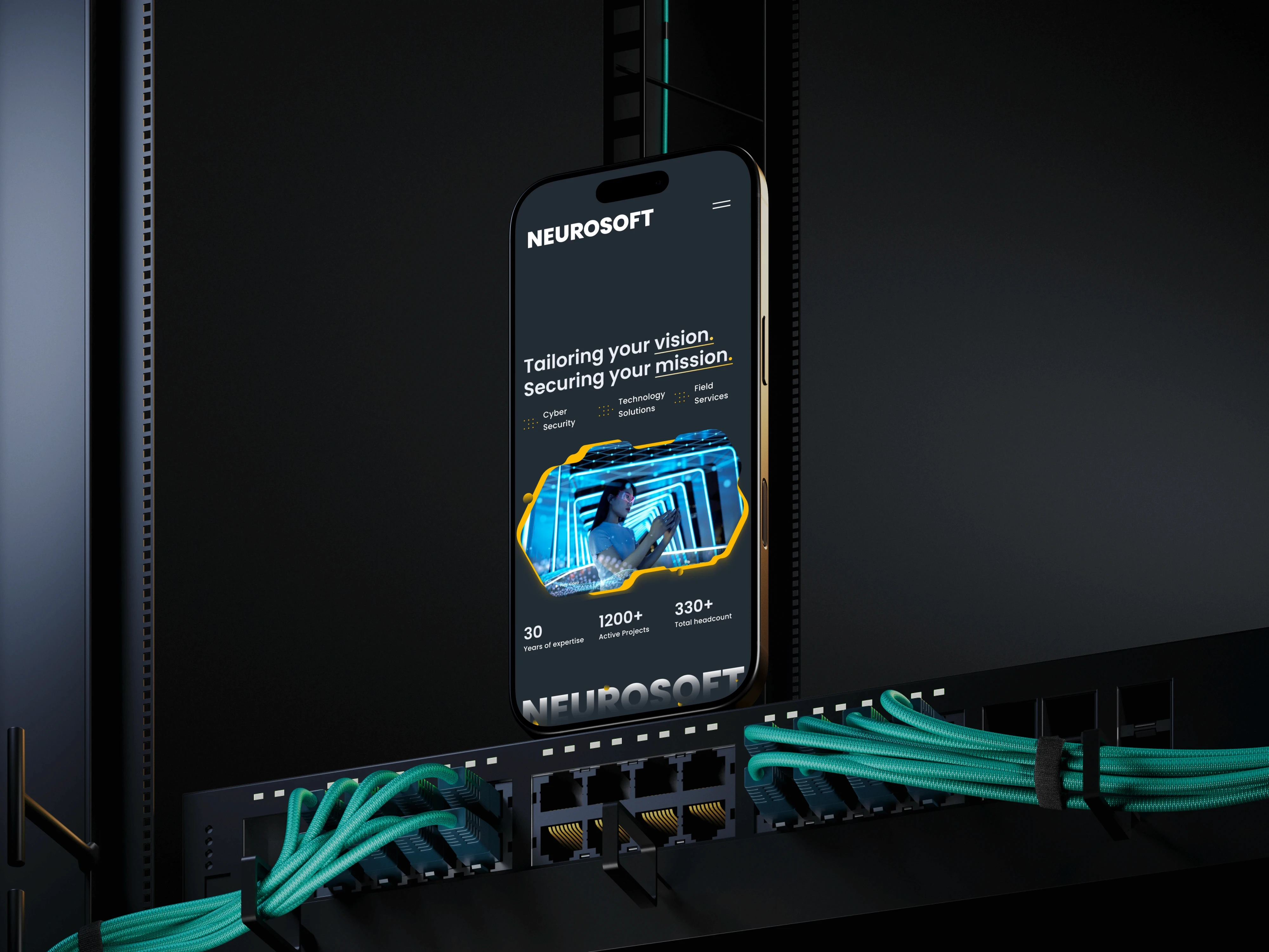
The redesign of the Neurosoft website introduced a new direction for the company’s digital identity — one that reflects its position as a strategic partner and technological leader. The goal was to balance innovation and human connection through a refined, minimal visual system.
Services
UX/UI DESIGN
, CREATIVE DIRECTION
Platform
Custom WordPress build using Bootstrap framework
Design Approach
The new design embraces a clean corporate minimalism enhanced by modern tech aesthetics. A restrained grey background conveys professionalism and clarity, while selective use of blue in icons and highlights maintains visual consistency and sophistication.
Imagery focuses on collaboration and partnership — handshakes, teamwork, and subtle human gestures — reinforcing the brand’s values of trust and reliability. The logo remains at the core of the hero section, establishing continuity and recognition, while a 3D sphere overlay adds a subtle touch of technological futurism.
VISUAL SYSTEM & DIRECTION
Minimal, premium design with decorative elements.
Monochrome foundation with accent blue for balance and focus.
3D and digital overlays to emphasize innovation and leadership.
Human-centered photography to express partnership and emotional connection.
Unified color palette for consistent presence across web and social assets.
COMMING SOON


